Wrap Text on Column Headers and Fixed Column Width

Hi all,

How do I wrap the column header text on UX? And also fixing the column width?

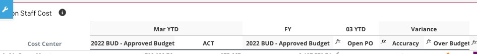
What happen is some of the column name is relatively long, and this is making the grid very untidy as some column is wider and some column is narrower even presenting similar numbers.

I have tried to change the “colWidths” parameter to something ridiculously small, but it appears UX is still making the column width to be the same length as the column header text.

What I want to achieve is something similar to Excel, we can increase the height of the column header, make it text wrapping, and then I can change the width of the column, but how do I do it?

Regards

Tat

Hi @twong ,

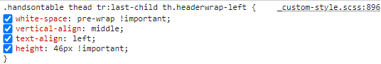
For wrapping the column headers, you can create a custom CSS Style and apply the format to a specific/all columns on …\apq-c3-custom\css\custom-style.css

something like this:

.handsontable th.Header-wrap  { 
    white-space: pre-wrap !important
 } 

Then just apply the ColumnFormat on the Advanced settings of the widget.

"columnFormat": {
      "": [
        {
          "className": "Header-wrap"
        }
      ]
    }

There are a few threads on that in the forum already:

For the column widths, after you applied the word wrapping, you can change dragging the cursor on the column then use the “save to options” on edit mode, and it will save the advanced settings, the code you can modify later on, might need a bit of testing on the size depending on the col header size.

  "table": {
    "colWidths": [
      285,
      120,
      120,
      120,
      170
    ]}

Hope this helps!

Thanks @rmazziero

Hopefully this will become part of the product in the future, since so many consultant/user requesting this feature.

1 Like

Hi,

I agree, I think this would be a good feature.

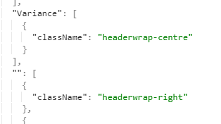
In the past I’ve also split out the classes to allow for header alignment, e.g. so rowset column headers can be left aligned and numeric columns right aligned at a client. Each option had a separate class which could be assigned in the advanced settings:

image

image

However I came across additional problems with wrapping the column headers:

Row-header height issue
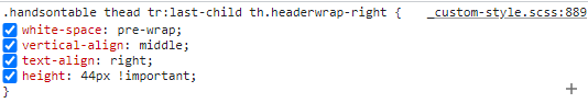
The header height becomes larger automatically for longer header names as they’re wrapped (e.g. 44px) but the row-header doesn’t grow with it and stays at the same height as the default (presumably because AngularJS is defining the element.style in-line in the HTML), so it causes a mis-alignment between the rows and the data in the rows:

image

I had to get around that by forcing the line height of the rowheader to be 46px and the column headers to be 44px (to account for the ibcs-class bottom borders).

image

Nested column dimensions
There’s also a knock-on issue caused when you have nested dimensions on the columns and you might need to only wrap the bottom column header, so you need to isolate it using something like tr:last-child or specifying the level e.g. th.columnHeaderLevel0, th.columnHeaderLevel1 in the CSS.

Would be great if for each column header you could just select wrap/no-wrap and left/centre/right alignment in the settings GUI and it did it all for you.

1 Like

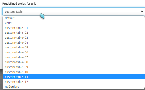
I prefer creating a dedicated predefined grid style for such purposes. This way you have more control over the style requirements for specific use cases and eliminate issues like misalignment between the first column and the rest of the columns.

Create the necessary style in css for the dedicated table style class.

/*   CUSTOM  TABLE STYLE 11 */
.handsontable.custom-table-11 table {
  border: 0px solid $brand-secondary !important;
  border-collapse: collapse;
}
.handsontable.custom-table-11 .htCore thead tr:first-child th {
  border-right: 0px solid $brand-secondary!important;
}
.handsontable.custom-table-11 .htCore th, .handsontable.custom-table-11 .htCore th.stripe {
  background-color: $brand-secondary !important;
  text-align: center !important;
  white-space: pre-wrap !important;
  vertical-align: middle !important;
  height: 60px !important;
  border-width: 0px !important;
  border-bottom: 2px solid $brand-gray-mid-lighter!important;
}
.handsontable.custom-table-11 .htCore th img {
  height: 36px !important;
  width: auto;
  margin: 0 auto;
  display: block;
}
.handsontable.custom-table-11 th.stripe.ht__highlight, .handsontable.custom-table-11 thead th.stripe.ht__highlight, .handsontable.custom-table-11 th.ht__highlight, .handsontable.custom-table-04 thead th.ht__highlight {
  background-color: $brand-yellow !important;
}
.custom-table-11 .handsontable th.ibcs- {
  border-bottom: 0px solid $brand-gray-mid-lighter !important;
}
.handsontable.custom-table-11 thead tr th {
  border-right: 0px solid $brand-gray-mid !important;
}

.custom-table-11 .handsontable th .fa-plus:before {
  color: $brand-gray-dark !important;
}
.handsontable.custom-table-11 tr td {
  border-color: $brand-secondary;
  vertical-align: middle !important;
  border-width: 0px !important;
  height: 32px !important;
}
.handsontable.custom-table-11 tr:nth-child(even) td.custom-table-11 {
  background-color: $brand-gray-light !important;
}
.handsontable.custom-table-11 tr td.subtotal {
  border-bottom: 2px solid $brand-secondary !important;
  border-top: 2px solid $brand-secondary!important;
  background-color: $brand-blue-light;
  font-weight: bold;
}
.handsontable.custom-table-11 tr td.total {
  background-color: $brand-blue !important;
  color: $brand-secondary !important;
  font-weight: bold;
}
.handsontable.custom-table-11 tr td.total a.expandcollapse {
  color: $brand-gray-dark;
}
.handsontable.custom-table-11 td.rowheader-wrapping > div > div {
  white-space: pre-wrap !important;
}
.handsontable.custom-table-11 .htCore tbody tr td:first-child[rowspan] div div, .handsontable.custom-table-11 .htCore tbody tr td div div {
  white-space: pre-wrap !important;
}

Then add your custom table name “custom-table-11” to the default.constant.js file under apq-c3-custom folder

"table": {
            "tableClass": [

                "zebra",

                "custom-table-01",

                "custom-table-02",

                "custom-table-03",

            ],

Open Settings and choose your grid style as you have defined on default.constant.js at the previous step;
image

Result

6 Likes

That’s great, I like the idea of having a custom table style - might have to use that in the future!

Nice one, That is a great concept @Ulas !

If it is just a text and if I know where to break line, I just create a text attribute including html line break code:
Element:

2022 BUD - Approved Budget

Attribute:
2022 BUD <br> Approved Budget
which will show

2022 BUD
Approved Budget

3 Likes