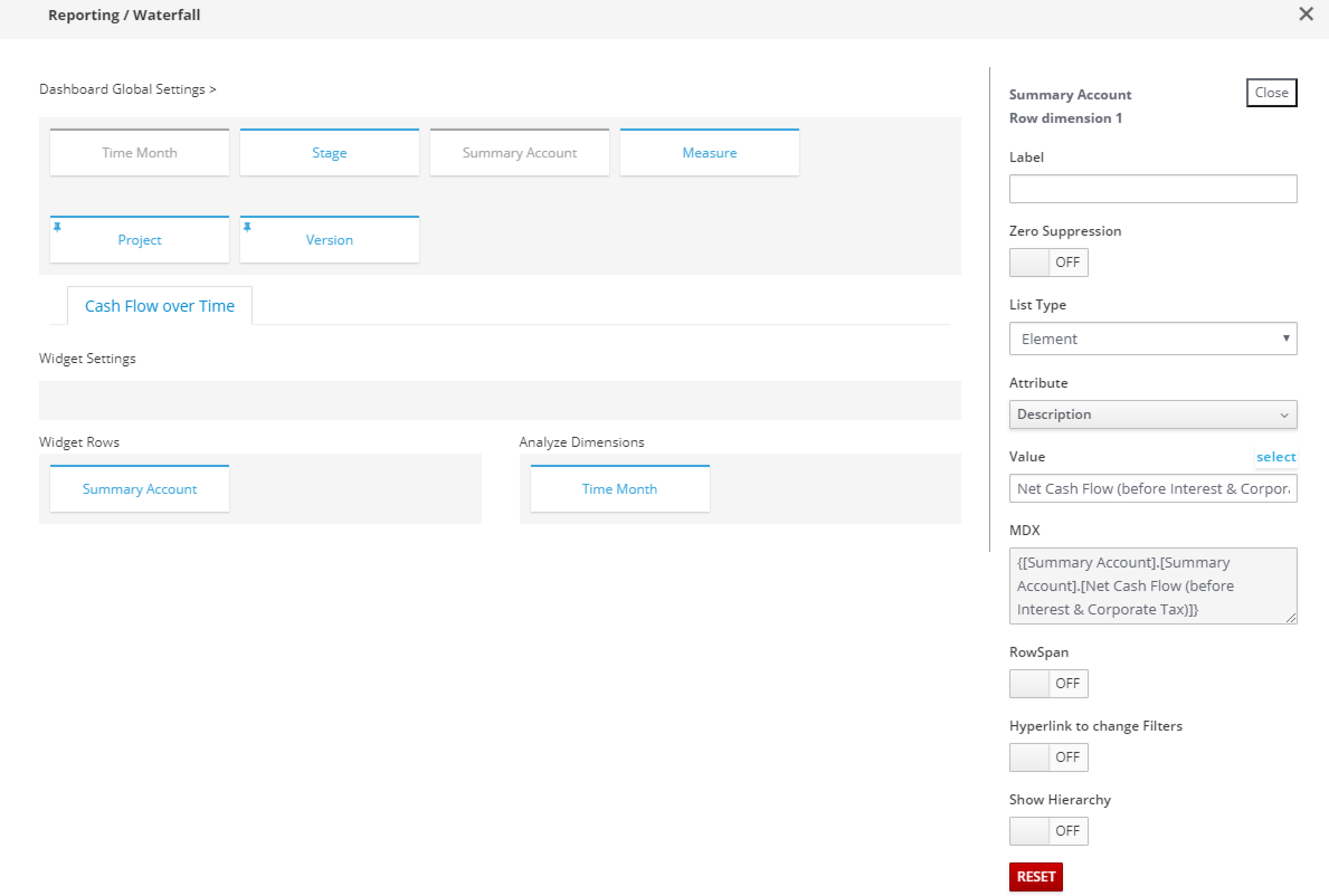
Can you also share a screenshot of your rows and analysis dimensions’ selection settings?
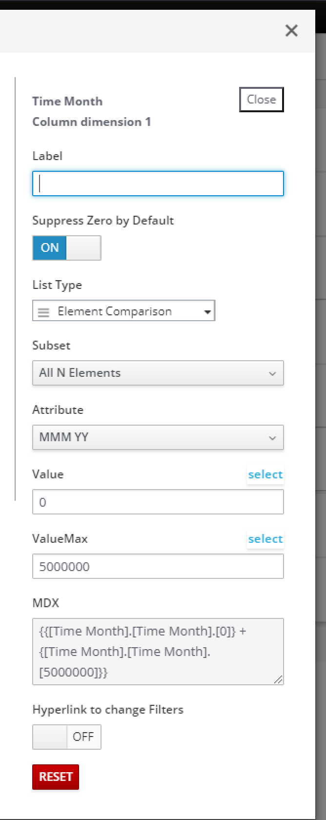
If you define i.e. Version or Time dimension in the rows by choosing element comparison (Starting value and Ending Value) and place the dimension you want to highlight changes in the analysis, then it should show neg values in red and positive in green by default (This you need to change from the custom css folder).
Yeap - Can you change the List Type to “Element Comparison” and define that staring value and ending value. The reason you getting an error is because your waterfall is configured without the 2 values above, therefore chart is only highlighting the changes.
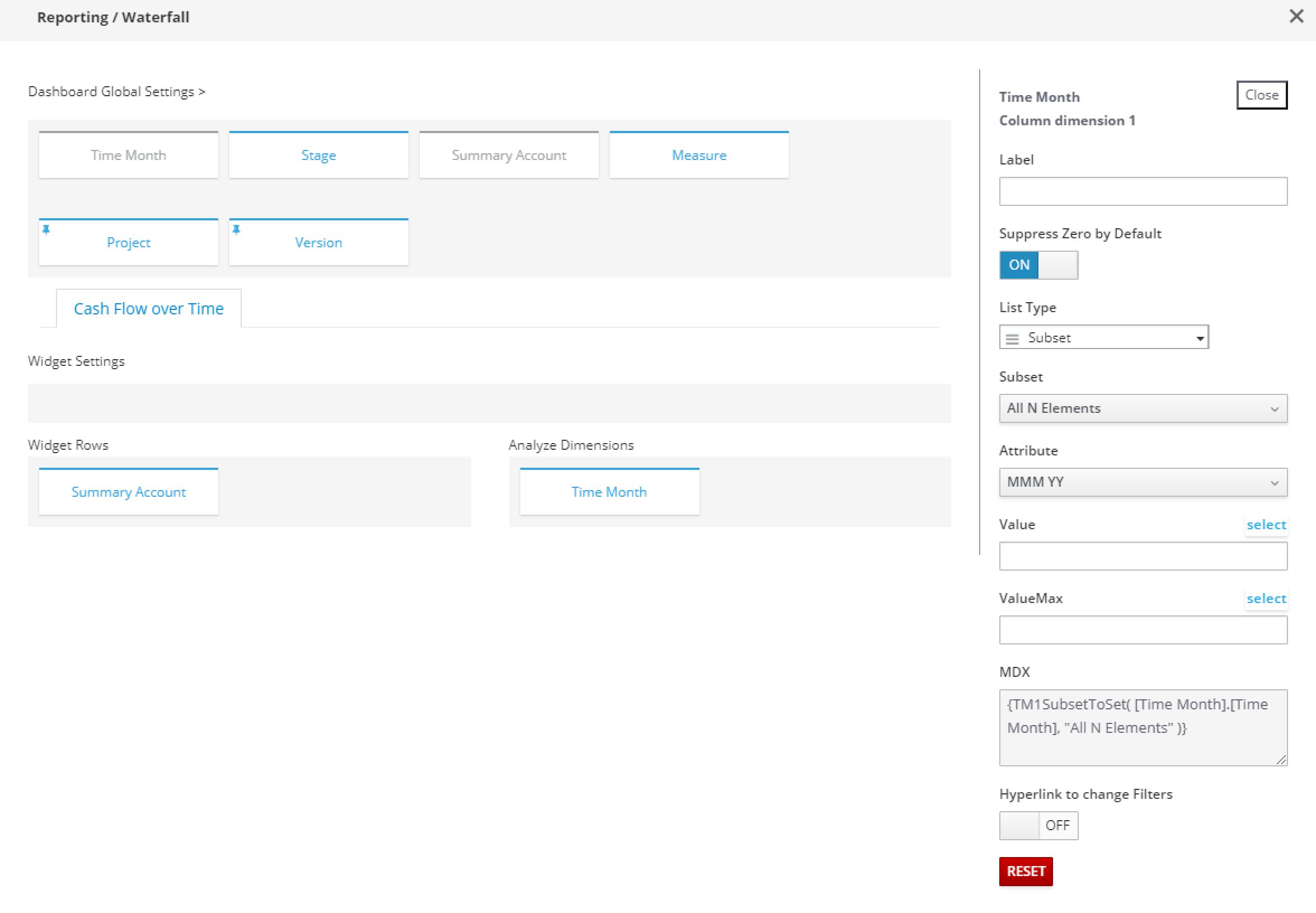
I would swap your Time Month dimension and Summary Account dimension. Your Time Month dimension would then be in Widget Rows with “element comparison” as a list type. Then you need to define your Value (2018) and Value Max (2019).
Place the Summary Account dimension in the “analyze dimension” with a selected subset.
In this case. you’d see 2018 and 2019 comparison highlighted with the selected subset of summary accounts.
Here is a general explanation how it is supposed to be used:
-
Two elements in rows that you want to compare, the bridge / waterfall will go from the total of the first to the total of the second
-
The elements you want to see the variances for go on the columns and it obviously only makes sense when they are on the same level, i.e. the total of the elements actually makes sense. So if you want to use the region dimension you would either go by all N elements or by the first rollup – you want the total of all elements to be the same like “World”.
-
The chart does all the maths itself:
o
Total of the first row is the number of the first (start) column
o
Total of the second row is the last column
o
Variance between first and second row is calculated for each column
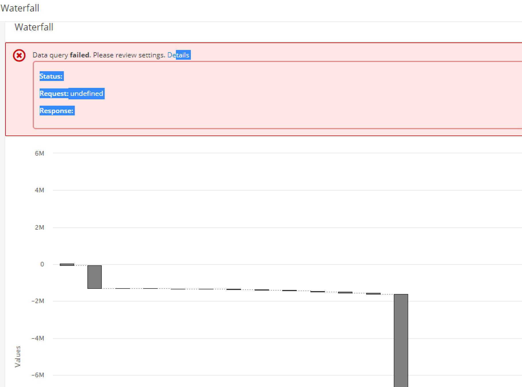
In my case I wanted to use the waterfall chart to show cash flows over time for a property development. I think the issue for the graph was that I did not have a total in the beginning.
From a graphing point of view it still worked, but the chart came back with the error message in it (displayed above).
Is there any other way I could do this or do we have to update the waterfall function to cater for scenarios like this ?
I see, you get the error message (which we should fix to actually tell you that) because we expect two elements on rows. What you could do is to just put an element that will return zero values on the first row and movements in cash in the second row. That should work.