I am having a layout requirement that we want to build on UX, but no matter how we try, it doesn’t seems displaying the way we want, so wanted to seek some advice here.
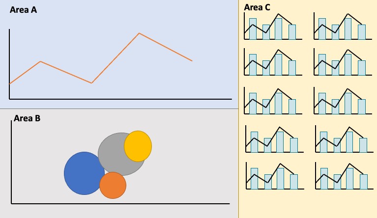
Area A and Area B are pretty simple, they are just 2 widgets one below another.
The problem is Area C, we would like to build some mini charts that go all the way to the bottom, and Area C should be automatically adjusting the size (Responsive). right now the only possible way for us to do something similar is to specify a fixed height, but our users are using different monitors, ranging from a 27", to iPad, to 14" laptop, to a 37" large monitor, the size looks very weird on screen and we are also not possible limit the resolution.
you will need to create a class for the custom html widget with the charts and for the have the .someClass{ position:fixed; height : calc(100% - 100px); top:100px; right:10px; overflow:auto; } this is to always have it fixed to the right of the page have the A & B only take up the 60% of the page in a normal grid use 7 columns. and in the right hand side use the class=“col-lg-5 col-md-5 col-xs-5” to take up the rest of the 5 columns, the right 10 px is to allow for the scroll bar the charts will have their own scoll bars inside and always be the height of the page minus 100px; Basically having the right hand side fixed position something like this W3Schools Tryit Editor but full height or something like this https://codepen.io/clairecodes/pen/bvWKdr