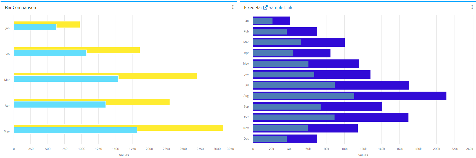
We would like to adjust the formula to calculate the variance percentage on the “KPI” widget:
I can see the formula is currently ACT/BUD-1, but this formula does not make sense, checking KPI Simple widget, there is an option to change to use (ACT-BUD)/BUD*100%, how do I do that in the “KPI” Widget?
I believe this is hardcoded in the widget but will confirm.
However A/B - 1 is mathmatically equivalent to (A-B)/B so I don’t understand why you would want to change this since the result is the same! If you wanted to display the KPI as A/B then I could understand better the rationale of the request.
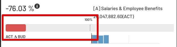
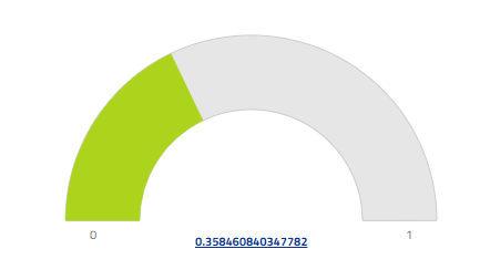
I was expecting to see the bar (showing in red) is the consumption % between ACT and BUD, let say I have budgeted $100, and so far I have spent $30, I still have $70 to spend or already consumed 30%.
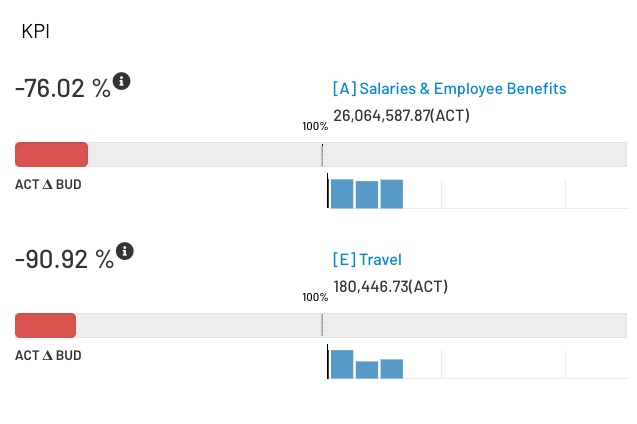
But right now I don’t quite understand the display at the moment, what is the red bar really representing? This is even more confusing -76% and -90% are so look alike.
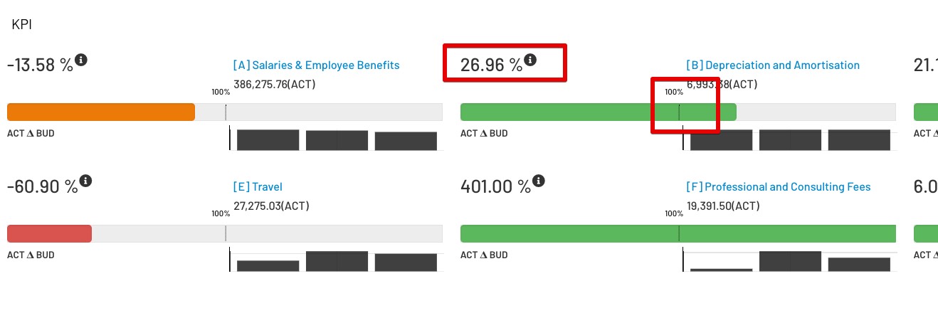
And if we include some positive, the chart again another confusing questions, reached 100% at the middle, but actually just 26.96%:
I think you are over-thinking it, or expecting something else from the widget than what it was designed for. The KPI widget is made to compare 2 values which should be comparable. E.g. for ACT vs. BUD then the comparison should be for the same unit of time! (e.g. BUD Apr YTD vs ACT Apr YTD).
1st example: If ACT is 26 and BUD is 108 then the KPI widget value is showing that ACT is 76% below target (or 24% of target which is what the bar shows)
2nd example: If ACT is 7 and BUD is 5.5 then the KPI widget value is showing that ACT is 27% above target (or 127% of target which is what the bar shows)
If you are comparing FY BUD with Apr YTD ACT and want to show in the 1st case that 24% of budget is consumed and 74% is still available then this isn’t the right widget selection. For this use case a custom chart might be better.
I guess if this can also somehow adjust to support expense type of measuring would be good, like in my case, I have $100, but only spent $30, so still 70% yet to spend, and this is quite a common use case I can foresee to use this chart.
Appears now the only way is to reverse enginneer this widget from scratch and make a custom widget out of it that looks almost exactly the same but will show the progress bar more “consumption” orientated.
OK now I get what you mean. You want to be able to define if negative variance is positive for the KPI. In which case for the first example ACT=26 BUD=108 the KPI would still read -76% but the progress bar would be green and would switch to red after passing 100%?
If this is what you want then I think that is a pretty reasonable enhancement request. There’s definately a use case for that. The only issue can see is in the complexity of the implementation as the advanced option for whether a positive or negative variance to target is “good” will be variable by series.
But maybe instead of 100% at the center, I may want to just simply show 0% ~ 100%, using different coloring to determine whether I am on a negative or positive variance, or maybe a range of 0%~30% as a color, 31%~50% as another color, then >50% as another color.