Hi there,
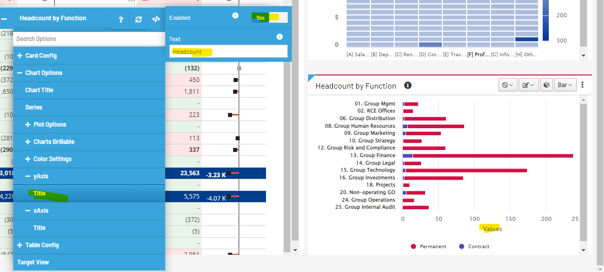
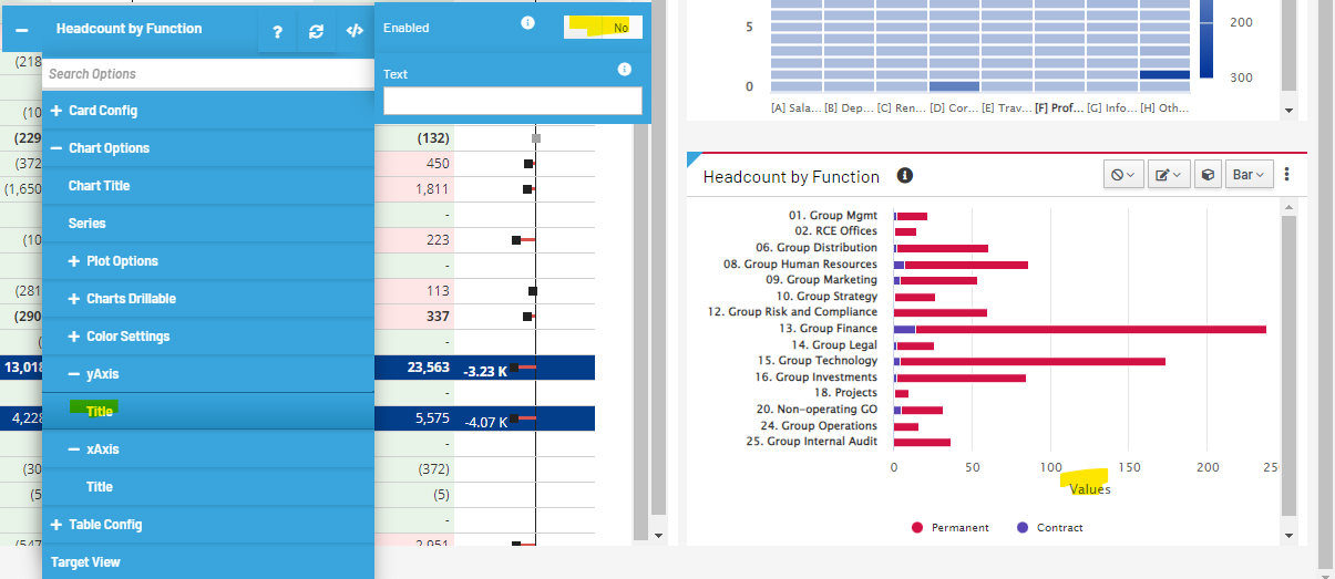
It seems I cannot control the x axis label at all in the bar chart.
UX version: 2022.06.00
In X axis disable title.
In Y axis enable title and set as “Headcount”.
In Y axis disable title.
I have tried all three approaches and refreshed. It still showing “Values”.
Any advise? Thanks, Chelsea.
Concerning the yAxis configuration in the advancedOptions, the yAxis is now configured to use an array (this was done to support the functionality of labels for percentages and handling more than 1 yAxis). Unfortunately this means that old configurations for yAxis will no longer work.
In the latest version of Apliqo (fix pack yet to be released), the yAxis configuration can be changed to yAxis0 and this will be applied correctly….
This is the way that advanced options will now save it.
Otherwise in the version you are using at the moment, to get this to work you can define your yAxis to look something like (where you wrap the object in square brackets):
{
  "chartOptions": {
    "yAxis": [
      {
        "title": {
          "enabled": false
        }
      }
    ]
  }
}
thanks @srichardson! working fine now.