[Next Gen UX] SeriesConfiguration color not applied to chart

Hi,

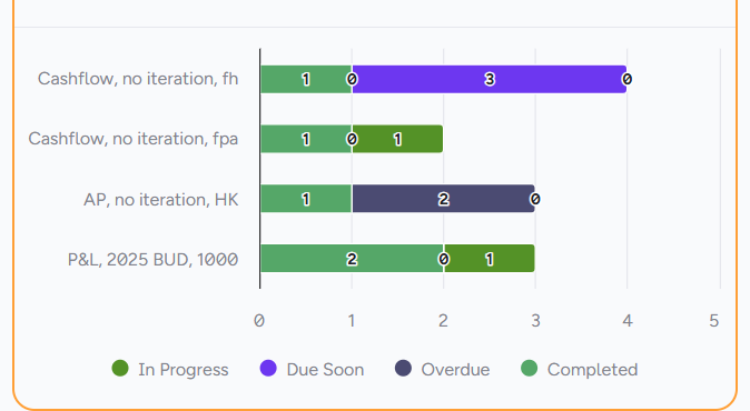
I’m trying to assign fixed colours to specific series by name in a bar/pie chart in Apliqo Next Gen, but the seriesConfiguration.series.color field does not seem to have any effect.

The problem with customColors
The current customColors approach assigns colours by index (0, 1, 2 …), which means colours shift whenever a series has no data and is excluded from the chart. I need colours to be bound to the series name, not the position.

What I configured

Under chartOptions.seriesConfiguration:

"seriesConfiguration": {
  "series": [
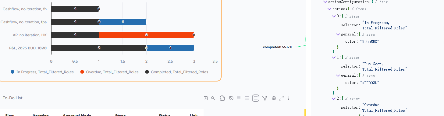
    { "name": "In Progress", "color": "#266EB0" },
    { "name": "Due Soon",    "color": "#FFD93D" },
    { "name": "Overdue",     "color": "#F3420B" },
    { "name": "Completed",   "color": "#333333" }
  ]
}

And set plotOptions.colors.selection to "default" to avoid customColors overriding it.

Result
No change. The chart still uses the default colour palette and ignores the color values in seriesConfiguration.

Questions

  1. Is seriesConfiguration.series.color a supported field in the current version of Apliqo Next Gen?
  2. If not, is there any supported way to bind a fixed colour to a series by name?
  3. Is this on the roadmap?

Color should be red. yellow.. etc.

Thanks!
Hi @Alexis ,

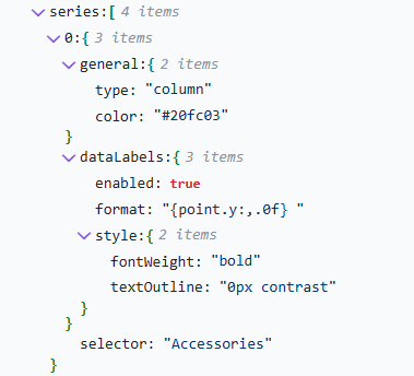
It appears in the latest gen it works slightly differently, the way I was able to change the colors and other configs on the charts (line style, etc), is by adding it under a “general” configuration inside the series, plus adding a “selector” option with the Series name.

See below:

Here’s the full JSON of a combined column and line chart example:

{
  "chartOptions": {
    "axisConfiguration": {
      "yAxis": [
        {
          "title": {
            "text": "$",
            "style": {
              "color": "#045174"
            }
          },
          "labels": {
            "style": {
              "color": "#045174"
            }
          }
        }
      ]
    },
    "seriesConfiguration": {
      "series": [
        {
          "general": {
            "type": "column",
            "color": "#20fc03"
          },
          "dataLabels": {
            "enabled": true,
            "format": "{point.y:,.0f} ",
            "style": {
              "fontWeight": "bold",
              "textOutline": "0px contrast"
            }
          },
          "selector": "Accessories"
        },
        {
          "general": {
            "type": "line",
            "color": "#045174",
            "dashStyle": "Solid"
          },
          "dataLabels": {
            "enabled": true,
            "format": "{point.y:,.0f} ",
            "style": {
              "fontWeight": "bold",
              "textOutline": "0px contrast"
            }
          },
          "selector": "Bikes"
        },
        {
          "general": {
            "type": "line",
            "dashStyle": "Dash"
          },
          "dataLabels": {
            "enabled": true,
            "format": "{point.y:,.1f}",
            "style": {
              "color": "#D89C60"
            }
          },
          "selector": "Clothing"
        },
        {
          "general": {
            "type": "line",
            "dashStyle": "Dot"
          },
          "dataLabels": {
            "enabled": true,
            "format": "{point.y:,.1f}",
            "style": {
              "color": "#D89C60"
            }
          },
          "selector": "Components"
        }
      ]
    },
    "tooltip": {
      "general": {
        "pointFormat": "<br>{series.name}: <b>{point.y}</b><br>",
        "shared": true
      },
      "style": {
        "fontSize": "12.8px"
      }
    },
    "plotOptions": {
      "series": {
        "lineWidth": 1,
        "marker": {
          "enabled": true
        }
      }
    }
  }
}

Hope this helps!

Rodrigo

In your case should be something like this:

"seriesConfiguration": {
  "series": [
    { "selector": "In Progress"
		,  "general": {
			"color": "#266EB0"
          }
	},
	{ "selector": "Due Soon"
		,  "general": {
			"color": "#FFD93D"
          }
	},
	{ "selector": "Overdue"
		,  "general": {
			"color": "#F3420B"
          }
	},
	{ "selector": "Completed"
		,  "general": {
			"color": "#333333"
          }
	}
  ]
}

It should work, hope it helps :slight_smile:

cheers

Works perfectly, thanks a lot!

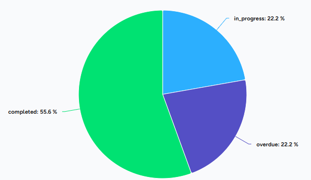
But seems like it doesn’t work for Pie chart …I’m trying to configure specific colors for each segment in a pie chart and treemap, but I can’t get it working with using seriesConfiguration with selector. Any ideas?

This case appears to be a bug, I tried here too, and it looks like it is never allowing the change the configurations, it is worth opening a ticket with the Apliqo team.

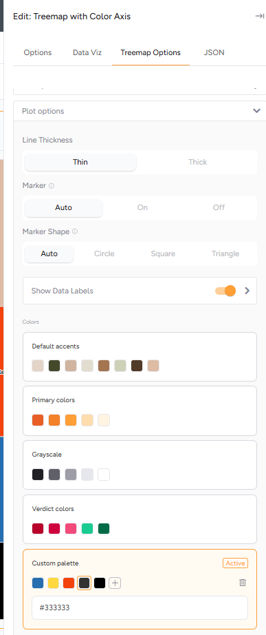
I tried using the “colors” options and custom palette but no luck unfortunately.

UX support portal:

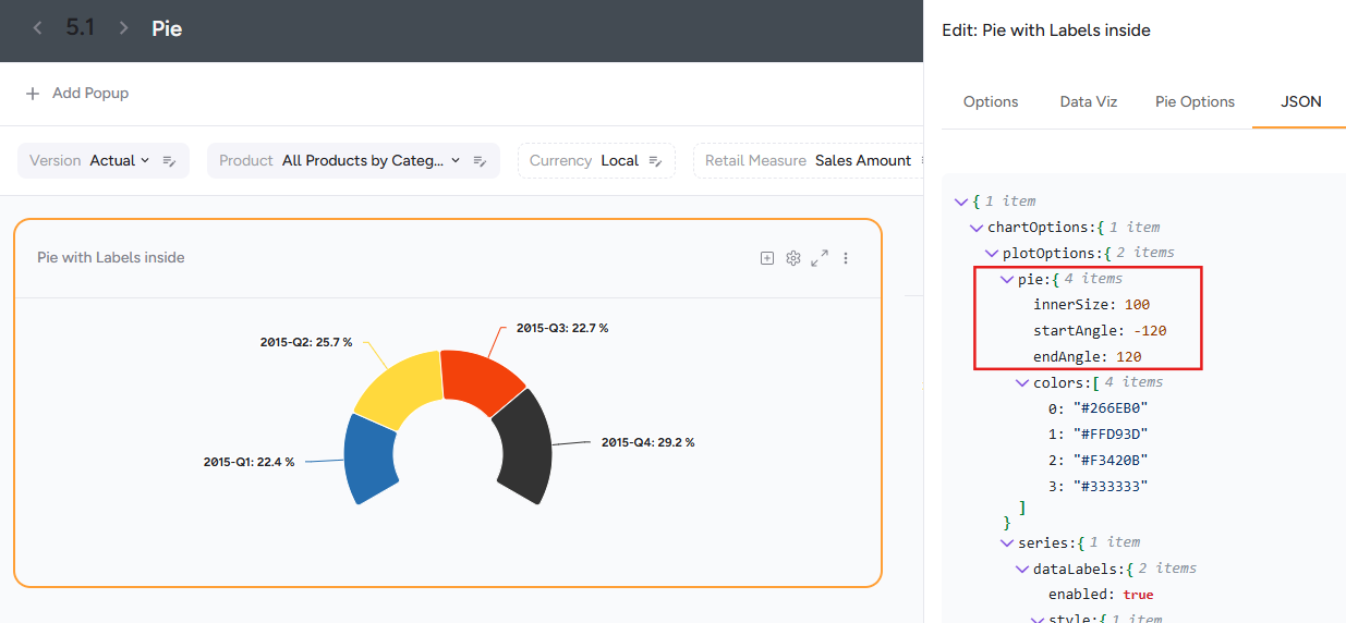
Actually, after some testing, you can use the “pie” setting, you can then change the colors.

The plot options colors on the UI settings is not working, but doing this directly on the JSON as below should do, just place the colors in the same order as your elements:

{
  "chartOptions": {
    "plotOptions": {
      "pie": {
        "colors": [
          "#266EB0",
          "#FFD93D",
          "#F3420B",
          "#333333"
        ]
      },
      "series": {
        "dataLabels": {
          "enabled": true,
          "style": {
            "color": "var(--carbon-900)"
          }
        }
      }
    }
  }
}

By they way, if you want to do a half donut, this is also the place where you would add the setting for it :slight_smile:

{
  "chartOptions": {
    "plotOptions": {
      "pie": {
        "innerSize": 100,
        "startAngle": -120,
        "endAngle": 120,
        "colors": [
          "#266EB0",
          "#FFD93D",
          "#F3420B",
          "#333333"
        ]
      },
      "series": {
        "dataLabels": {
          "enabled": true,
          "style": {
            "color": "var(--carbon-900)"
          }
        }
      }
    }
  }
}

For the Treemap you should be able to use the plot Options colors options, creating a custom palette.