Just wanted to know if it’s possible to format specific labels and/or datapoints in a chart.
I’ve read the documentation and want to play with the dataLabels and plotOptions parameters, but the documentation doesn’t state what the properties and methods of these objects are.
Example of what I want to do: give some labels a bold format, change the shape of the datapoint into a diamond for some datapoints (instead of rectangle or circle).
I am not aware of an advanced option but you can do this from the custom CSS folder. You can identify the object from the console by inspecting it and then add it to the CSS file with the customization you want to apply.
Hi Luc, you can generally apply all highcharts options through the advanced options object. The highcharts API is vast and has a good documentation with a lot of examples. The trick is in a lot of cases to apply the option on the right level, which can take a bit of trial and error and reading through the manual but it’ll work in the end. To change the markers for example: plotOptions.series.marker.symbol | Highcharts JS API Reference - applied to the advanced options it can look like this (makes the first data series marker a triangle):
“chartOptions”: {
“series”: [
{
“marker”: {
“symbol”: “triangle”
}
}
]}
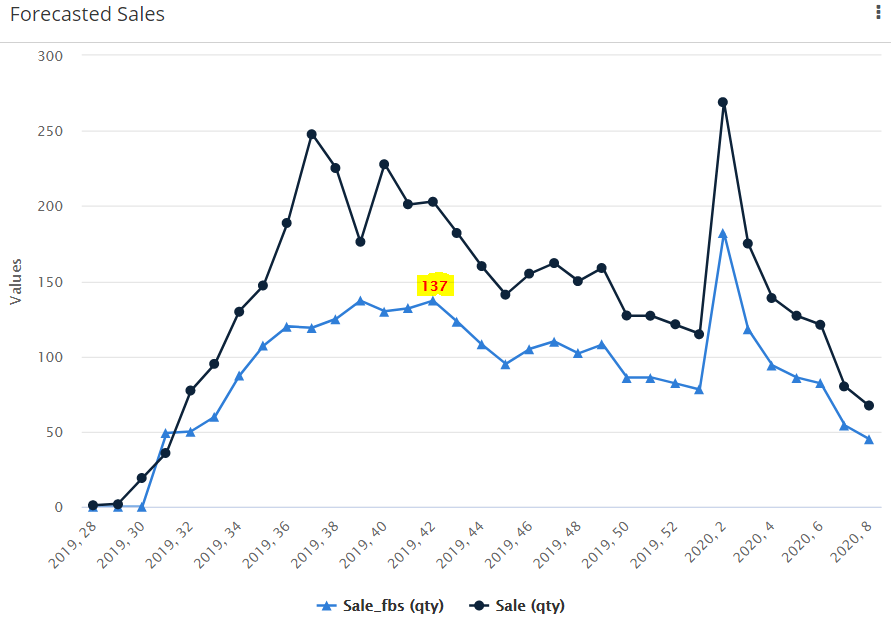
Hi Andreas, thank you put me on the right track. You are right that it takes some investigation and there surely are a lot of examples. I managed to get a data label only for the data point where I want it to show.
For now this solution is ok to highlight the current week in the chart. Ideally I want to show an annotation in the chart, but I’ve seen this has not been implemented in the advanced options of UX.