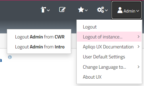
I’m sure this could be an easy one for any CSS experts out there. I noticed that in UX apps where we use a custom font, the boxes around User Profile dropdown render with a gap between the selection and sub-selection (e.g., “logout of instance…” and the options to the left). This appears to be happening because my custom font is skinnier than the the default font (as this gap does not appear in Apliqo_Demo). The gap isn’t so much of a problem visually but rather selecting the sub-items can be difficult unless you move your mouse very quickly to the left (or else the entire menu closes).
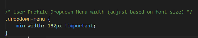
I’ve tried to dig into the bootstrap CSS to figure out where I can increase the padding around the submenu. It appears to be defined by one of the “dropdown-menu” or “dropdown-submenu” classes but I can’t figure out exactly which one. Any advice would be greatly appreciated!