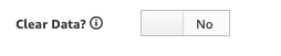
We are building a new user input template that requires users to enter boolean data. In our first release we used the standard check box feature, and that works, but it doesn’t “look great” according to our users. One of our users asked if there was a way to make the check box look like the TI checkbox. I know these are different controls, but I figured I would ask.
The canvas directive in UX, is used to display a checkbox that are used in process popups.
For example:
<tm1-ui-dbr-checkbox
ng-if=“option.FieldType==‘Checkbox’”
tm1-instance=“ApliqoFPM”
tm1-cube="}APQ Dimension Definition"
tm1-elements="