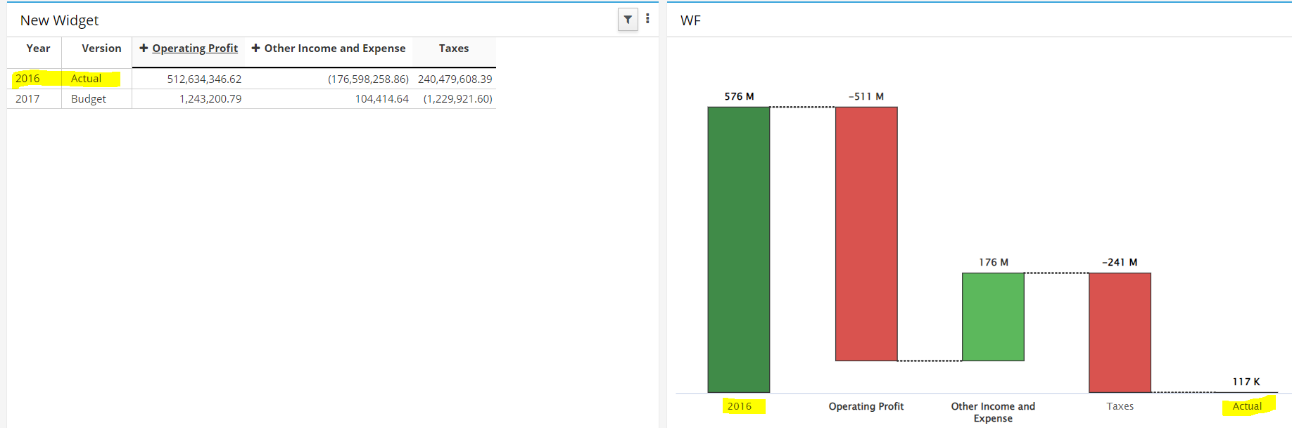
I am trying to create a waterfall chart to bridge between a different year and different version e.g. 2021 forecast and 2022 budget. I can create the view with just the two rows, but the waterfall chart is picking up the starting description from the first dimension in the row and the ending description from the second dimension in the row.
Is there a way to pick up the element name from the same dimensions for the totals at the beginning and end?
Have you tried changing the attribute for the row dimension to be something else containing the names that you are after, assuming that I understand you correctly?
In the waterfall chart it currently shows 2022 on the left and forecast on the right. It’s mixing the two dimensions on the rows and just using the elements from the first row.
I am not aware of a real fix but I fixed this issue by creating a new string attribute called “WF NY” and populated with 2017 for the “actual” element. It’s not elegant at all but it does the job.
Obviously, It could become very quickly messy as soon as you have more of such requirements…
I have similar issue while the columns name were fine (around Nov’21). It just does not work now.
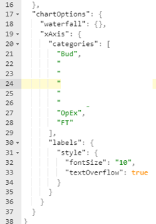
If your xAxis name is sort-of fixed, my workaround is to hardcode the categories in the chartOptions.
This, at least, can keep the ‘Bud’ in the most LHS and ‘FT’ in the most RHS column
But keep in mind that, I found out the length of name has limitation. When your xAxis name is too long, the name will ‘shift’ and you will find e.g. ‘Account C’ replaces the name of column ‘FT’, and the column ‘FT’ itself will merge or disappear.
This issue was fixed in the recent releases so not sure if you need to hardcode them in the chartOptions.
I haven’t tried this option in the waterfall, can you post a screenshot?
I observed the waterfall doesn’t behave correctly when you use an attribute in one of the row/column dimensions and the attribute has blank values.
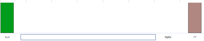
It turns out the FT is replaced by ‘Operating Expenses’ and total columns are now 7 instead of 8.
I tried several time with diff. length of words and guess it’s the case. And our UX will be upgraded in a newer version soon so I will try again later