Hi,
Is it possible to remove the lines between the columns in the waterfall charts?
Thanks?
You can do so by adding in the following advanced options for the widget:
{
  "chartOptions": {
    "plotOptions": {
      "series": {
        "lineWidth": 0
      }
    }
  }
}
Hi @srichardson,
I’ve added that in but it doesn’t seem to change anything. I tried it in the demo model as well, and couldn’t get it to work.
I just reconfirmed that this works.
There are a few other settings that should have the same effect.
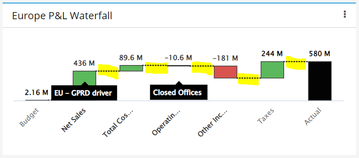
Basically you will need to set the lineWidth to 0 as there is no way to remove the dashed line… you can changed the dashed line to a different style but you can’t remove it.
I don’t know if you can use custom css in Apliqo, but I’ve removed the lines between -
(part highlighted is an inverted waterfall mixed with normal columns)
with this:
.highcharts-waterfall-series .highcharts-graph {
  stroke: transparent !important;
  stroke-dasharray: 0, 0;
}
Yes, this should be possible via custom css.