Hi,
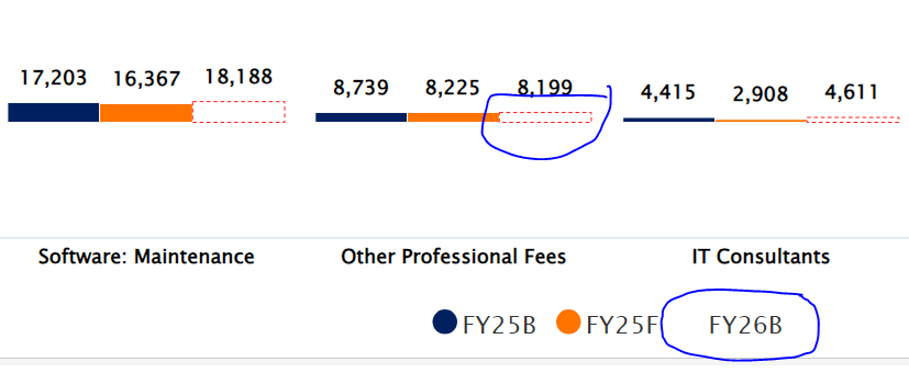
We recently tried to show a bar in a column chart as hollow by making it white with a dotted red outline. However, we noticed that the outline doesn’t appear in the legend. In the chart FY26B is the red-outlined column in question, the legend isn’t displaying as expected. Instead it’s just blank. Is there a way to get the legend to display correctly?