Hi,
the customer is experiencing a strange behaviour with the format of the y-axis values for a line chart.
For filter element A it looks like this (desired display)

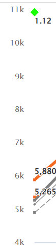
For a different filter element the values are abbreviated (not desired)
How can the first formatting be forced?
Best,
Alex